
My motivation
After tinkering around with the default WordPress theme, it became clear to me that I wanted another design for my homepage. It should be crisp and clear and only contain the elements that are absolutely vital. Nothing should distract the reader and no special reading mode should be necessary. To clarify what exactly this means, I created a simple prototype of my homepage in Apple Keynote. The prototype looked similar to Microsoft’s Metro designs, but no “metro” WordPress theme suited my needs. Therefore I decided to roll my own theme. It turned out to be easier than I thought.
The theme should be:
- Simple and Clear
- Responsive: It should look good on both Smartphones and Desktop PCs
- Nicely colored
For simplictiy and clarity, I started the theme from scratch. Now only the WordPress parts that I wanted showed up in the theme. No sidebar, no comments, no creation dates, etc.
Tools
I decided to use Skeleton because I wanted a responsive web page. Skeleton is a CSS framework that lays out the webpage in 12 columns. It takes care to adjust the size of these columns to the width of the screen. It also adjusts some other factors, like the font size. And it comes with a good-looking default font.
The web site should have a nice color scheme. However, I am not an expert in creating a color scheme. Fortunately, this is not required any more today. There are web services that help you decide which colors to use. I used Colorpick. It lets you choose between different color sets. You see the palette applied live to the website. And if you like it, it will show you the CSS code for the color set. Nice, isn’t it?
Development
With these basics at hand, I could get started.
Development Environment
For the development phase I used a local server, so I did not have to mess around my homepage in the internet. I used MAMP for MacOS. It comes with Webserver, PHP Server and MySQL – everything I needed. Similar solutions are also available for Windows and Linux. In this local server, I installed a fresh copy of WordPress.
Create the theme
I started out by creating a folder for the theme. It belongs in the WordPress directory under wp-content/themes/. I called my theme “crispmetro”. For a minimal functioning WordPress theme, we only need two files: index.php and style.css. I copied the files from the Skeleton theme here. The Skeleton framework comes with a file index.html. It is a static web page that includes all the necessary CSS. It also shows the usage of Skeleton with some default content. By changing the file ending to php, I got the first of the two files. Then I created the files style.css. It needs to be in the same directory as index.php. Don’t put it into the subdirectory CSS that comes with Skeleton. To begin with, all we need are some comments at the top of the file. These comments are used by WordPress to get the name, author, etc. of the theme.
/*
Theme Name: Crisp Metro
Theme URI: www.heinbockel.eu
Author: Stefan Heinbockel
Version: 1.0
*/
Now I had a WordPress theme that I could activate in the WordPress backend. When I viewed my local homepage in the browser it showed the Skeleton default page, which I expected, as this was the base for my index.php. But it did not look that nice anymore! It turned out that the CSS files were not loaded. The reason is that the files are now coming from the server, so the relative path of the CSS file did not work anymore. I needed to give the complete path of the file. So I changed the CSS include statement like this:
<link rel="stylesheet" href="/wp-content/themes/crispmetro/css/skeleton.css" type="text/css">
While at it, I also added the WordPress code to include the file style.css
<link rel="stylesheet" type="text/css" href="<?php echo get_stylesheet_uri(); ?>">
Now the CSS files could be loaded, and the page was styled again. The file style.css became the starting point for my own stylings. For example, I would add all the colors from the colorscheme that I chose.
Build the theme
Then I started to extend index.php to show the list of the posts with the WordPress main loop:
<?php while (have_posts()) : the_post(); ?>
    <div class="row">
        <div class="twelve columns">
            <h2><a href="<?php esc_url(the_permalink()); ?>"><?php the_title(); ?></a></h2>
                <?php the_content(); ?>
        </div>
    </div>
<?php endwhile; ?>
You can see that I already used divs with the classes “row” and “twelve columns”. This is the way to tell Skeleton how to lay out the page. This code will put each post into a row that spans all columns. Remember that Skeleton uses twelve columns in total.
I also wanted to have a thumbnail image next to the text of a post. I reduced the number of columns available for the text to nine and added another div with three columns for the thumbnail image:
<?php while (have_posts()) : the_post(); ?>
    <div class="row">
        <div class="nine columns">
            <h2><a href="<?php esc_url(the_permalink()); ?>"><?php the_title(); ?></a></h2>
                <?php the_content(); ?>
        </div>
        <div class ="three columns">
            <?php if(has_post_thumbnail()) {the_post_thumbnail(); } ?>
        </div>
    </div>
<?php endwhile; ?>
At this point I could already see the responsiveness. By reducing the width of the screen, at a certain point the image would show up under the text, allowing for a better readability on small screens.
A WordPress theme does not support post thumbnails out of the box. You have to tell WordPress that you want to allow it. For this purpose I needed to create the file functions.php. There, I added the line:
<?php add_theme_support('post-thumbnails'); ?>
Menus
I also wanted to have two menus. A menu at the top and another one in the footer. These menu positions need to be declared in functions.php:
<?php register_nav_menu('primary', 'Primary Menu'); ?>
<?php register_nav_menu('footer', 'Footer Menu'); ?>
In order to show the Primary Menu, I added it below the title of the page, wrapped into the Skeleton divs as well:
<div class="row">
    <div class="twelve columns">
        <nav class="primary_menu">
            <?php wp_nav_menu(array('theme_location' => 'primary')); ?>
        </nav>
    </div>
</div>
The menu that the WordPress code produces is just an unnumbered list of links.
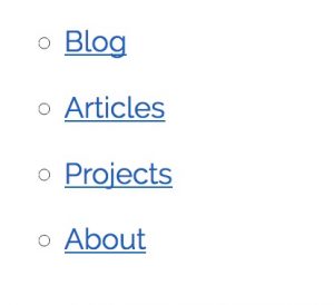
So I’ve decided to give it a more pleasant look with CSS:
.primary_menu ul {
    list-style-type: none;
    margin: 0;
    padding: 0;
    overflow: hidden;
    background-color: rgb(33,150,243);
    height: 50px;
}

.primary_menu li {
    float: left;
}

.primary_menu a {
    display: block;
    color: black;
    text-align: center;
    padding: 14px 10px;
    text-decoration: none;
    color: #eeeeee;
}
Now the menu looks more like a real menu.

I also added a media query to give it more space on bigger screens:
@media (min-width: 550px) {

    .primary_menu a {
        padding: 14px 25px;
    }
}
And I wanted the link that was currently active to be highlighted:
.primary_menu li a:hover {
    background-color: rgb(100,181,246);
}
Different Page Types
Moreover, I wanted to have a different style for the overview page of the categories. WordPress looks for this code in a file named category.php. In order to achieve it, I simply copied the file index.php to category.php and adapted it accordingly.
Now I had a lot of duplicate code in the header, like all the CSS links. This means I had to make all the changes to these statements in every file. To avoid this, I moved the common code to a new file called_header.php_.
<!DOCTYPE html>
<html lang="en">
<head>

  <!-- Basic Page Needs
  –––––––––––––––––––––––––––––––––––––––––––––––––– -->
  <meta charset="utf-8">
  <title><?php bloginfo('name'); ?></title>
  <meta name="description" content="">
  <meta name="author" content="Stefan Heinbockel">

  <!-- Mobile Specific Metas
  –––––––––––––––––––––––––––––––––––––––––––––––––– -->
  <meta name="viewport" content="width=device-width, initial-scale=1">

  <!-- FONT
  –––––––––––––––––––––––––––––––––––––––––––––––––– -->
  <link href="//fonts.googleapis.com/css?family=Raleway:400,300,600" rel="stylesheet" type="text/css">

  <!-- CSS
  –––––––––––––––––––––––––––––––––––––––––––––––––– -->
 <!-- <link rel="stylesheet" href="/wp-content/themes/crispmetro/css/normalize.css" type="text/css"> -->
  <link rel="stylesheet" href="/wp-content/themes/crispmetro/css/skeleton.css" type="text/css">
  <link rel="stylesheet" type="text/css" href="<?php echo get_stylesheet_uri(); ?>">
<!--  -->
  <!-- Favicon
  –––––––––––––––––––––––––––––––––––––––––––––––––– -->
  <link rel="icon" type="image/png" href="images/favicon.png">

</head>
<body>
<div class="container">
    <div class="row">
        <div class="seven columns">
            <h1><a class="page_name" href="<?php echo esc_url( home_url( '/' ) ); ?>"><?php bloginfo('name'); ?></a></h1>
        </div>
        <div class="five columns">
            <span class="page_description"><?php bloginfo('description'); ?></span>
        </div>
    </div>
    <div class="row">
        <div class="twelve columns">
            <nav class="primary_menu">
                <?php wp_nav_menu(array('theme_location' => 'primary')); ?>
            </nav>
        </div>
    </div>
I removed this code from index.php and category.php and replaced it with this PHP snippet:
<?php get_header(); ?>
WordPress replaces this snippet with the code from header.php every time the page is loaded. This is a good way to avoid duplication. But keep in mind that now neither header.php nor index.php or category.php show the complete source code of the page. They are put together automatically by the WordPress backend.
The same is true for the footer code, which is loaded from footer.php with
<?php get_footer(); ?>
I also wanted a different look for the detail page of an article. The code for this page belongs into single.php. Then I noticed that even though now my articles looked good, my static pages still used the theme from index.php. It turned out that for them another file page.php is needed.
Further tweaks
Category page as home page
For my home page, I wanted my start page to show all the articles from the category “Blog”. This is like the news section of my home page. But in WordPress, the start page can either show all your articles or a static page. With a little help from Google and Stackoverflow, I found out how to do it. The trick is to create a custom page template, which I called blog.php. In the header, I put the template name in a PHP comment. Afterwards I put some code that filters all the articles from the category “Blog” by using its “slug”. The slug is a short name of a category and can be set in the WordPress backend. The code looks like this:
<?php /* Template Name: Blog Posts */ ?>


<?php get_header(); ?>

    <div class="row">
      <div class="twelve columns category_description">
        <?php echo category_description(get_category_by_slug( 'blog' )->term_id) ?>
      </div>
    </div>
    <?php $posts_in_category = get_posts(array('category_name'=>'blog'));
        if($posts_in_category) {
            foreach($posts_in_category as $post) :
                setup_postdata($post);
            ?>
        <div class="row post_list_entry clearfix">
            <div class="nine columns post_list_entry_text">
                <h2><a href="<?php esc_url(the_permalink()); ?>"><?php the_title(); ?></a></h2>
                        <?php the_content(); ?>
            </div>
            <div class ="three columns">
                    <?php if(has_post_thumbnail()) {the_post_thumbnail(); } ?>
            </div>
        </div>
    <?php endforeach;
    wp_reset_postdata();
    }
    ?>
    <?php get_footer(); ?>
</div>

<!-- End Document
  –––––––––––––––––––––––––––––––––––––––––––––––––– -->
</body>
</html>
In order to make this page the start page, I created a static page and set its template to “Blog”. After that I could turn this static page into the start page.
Square divs
For my about page, I wanted to have four squares presenting the content in a 2×2 grid. For this purpose, I had to create another custom page theme, which I called about.php. Using Skeleton, it was easy to have the two divs in a row occupy the same space. I assigned to both of them the class “six columns”. So now the divs had the same width, but the height was not the same as the width. So I had to add some CSS code:
<?php /* Template Name: About */ ?>


<?php get_header(); ?>

    <div class="row">
        <div class="six columns odd square">
            <div class="square_content">
                Content of square one
            </div>
        </div>
        <div class="six columns even square">
            <div class="square_content">
                Content of square two
            </div>
        </div>
    </div>
    <div class="row">
        <div class="six columns even square">
            <div class="square_content">
                Content of square three
            </div>
        </div>
        <div class="six columns odd square">
            <div class="square_content">
                Content of square four
            </div>
        </div>
    </div>
    <?php get_footer(); ?>
</div>

<!-- End Document
  –––––––––––––––––––––––––––––––––––––––––––––––––– -->
</body>
</html>
.square:before{
    content: "";
    display: block;
    padding-top: 100%;
}

.square{
    position: relative;
    margin-top: 15px;
}

.odd.square {
    background-color: rgb(100, 181, 246);
    color: #eeeeee;
}

.even.square {
    background-color: rgb(100, 255, 218);
    color: #222222;
}

.square_content{
    position: absolute;
    top: 0;
    left: 0;
    bottom: 0;
    right: 0;
    padding-top: 20px;
    padding-left: 20px;
    padding-right: 20px;
}
Now I could choose this files as the theme for a static page and have my custom styled about page. The result looks like this:
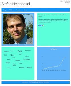
Skeleton even takes care of putting the squares below each other when the screen becomes smaller.
Other Tools
At the end, I would like to mention some other tools that I used during this project. They turned out to be invaluable to me:
- Firefox with its developer tools. With the developer tools it was very easy to find out the reason when the webpage did not look the way that I expected.
- Git as version control system. Although this was only a small project, it was very useful to have the ability to try something out and throw it away in case it did not work out.
- The web. Almost every question that I had was already solved by someone else. Most of the time the solution was found either on WordPress.org or on Stackoverflow. So if you search there, you should be able to find answers to your questions as well.
Wrap Up
Yes, and that was pretty much it. I uploaded the theme to my webspace via FTP and then applied it to my homepage. At the end, I had the following files:
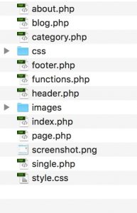
The file screenshot.png is only for the WordPress backend. It is used to show you the preview of the theme in the themes overview.
With these steps you should be able to build your own responsive theme from scratch. If you like this post, please leave me a note.
One reply on “Want to build a responsive WordPress theme? Here is how.”
[…] Last week I finished the new WordPress theme for my home page. I built it from scratch to be crisp and responsive. If you want to learn how I did it, click here. […]